Who’s the client
Snoonu is Qatar’s super-app — food, groceries, pharmacy and more, with “fastest delivery” as its core brand promise. They had over 300,000+ registered users at the time (Mar 2022).
- 12 categories living in the app — discovery can’t drown the core food-ordering flow.
- Every screen has to be mirrored not just for Android & iOS, but also for Arabic and English.
The goal from product team
“Make ordering faster.” But a faster courier wasn’t ours to give from a design file. So we reframed the problem the app could actually solve.
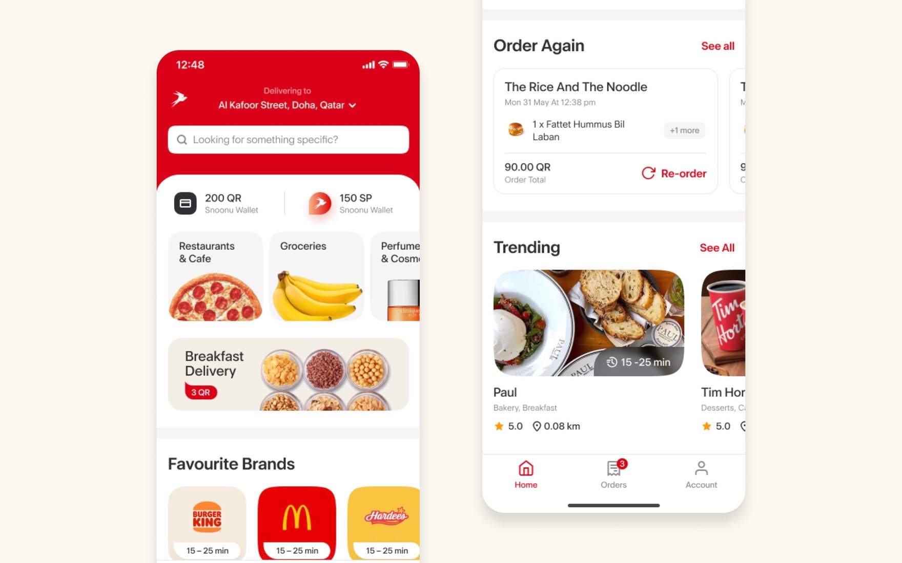
The home screen is a triage screen
A returning user usually wants one of three things. Home is ranked to answer all three before they scroll.
- Address first, everything second.
- “Order again” earns its place high.
- Wallet & balance, in plain sight.
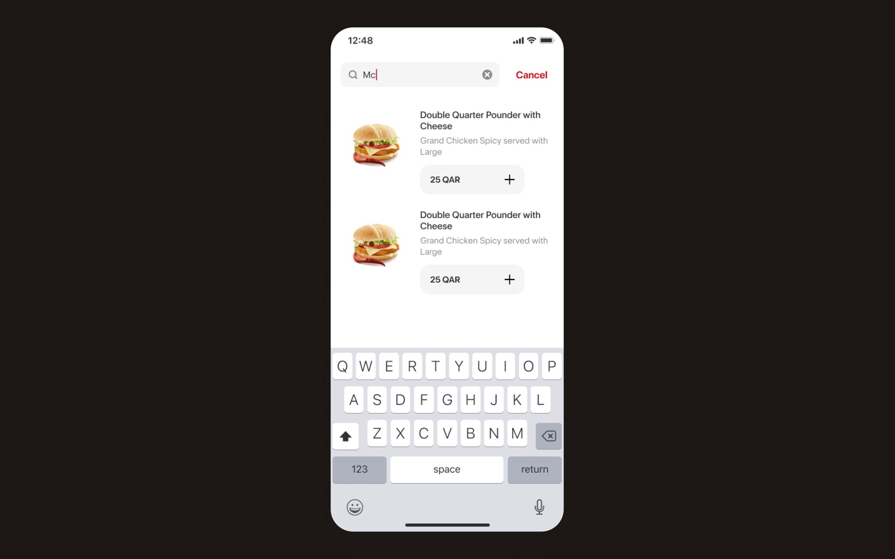
Almost 80% of users looked for a dish, not a restaurant
A few principles that we used in the design:
- Item-level results. Typing “Mc…” surfaces the exact product with its price and an add button.
- Add without leaving. The inline ”+” lets a decided user build a cart straight from results, skipping the merchant page entirely when they don’t need it.
- Instant, not on submit. Results stream as they type; the keyboard never has to be dismissed to see if it worked.
Users could still search for restaurants.
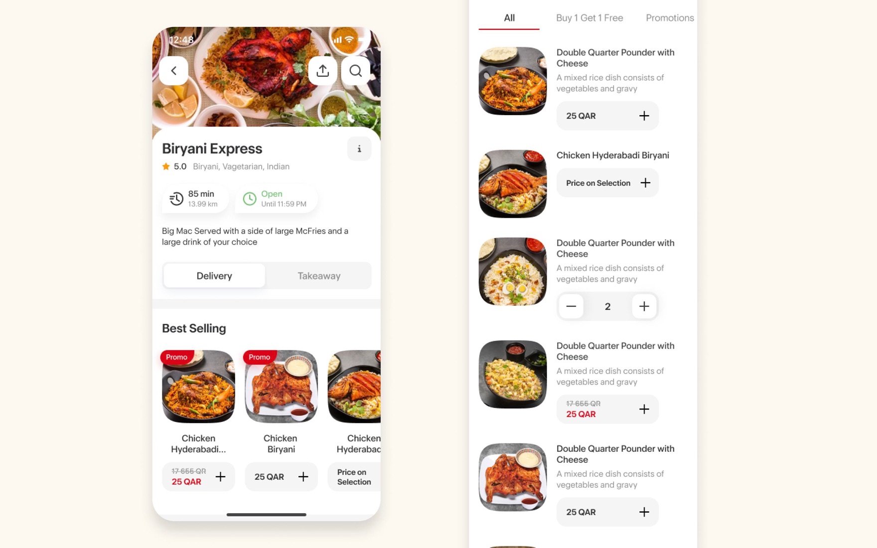
Merchant page
80% of decisions happen here. So the merchant page leads with trust, then removes choice paralysis before it starts.
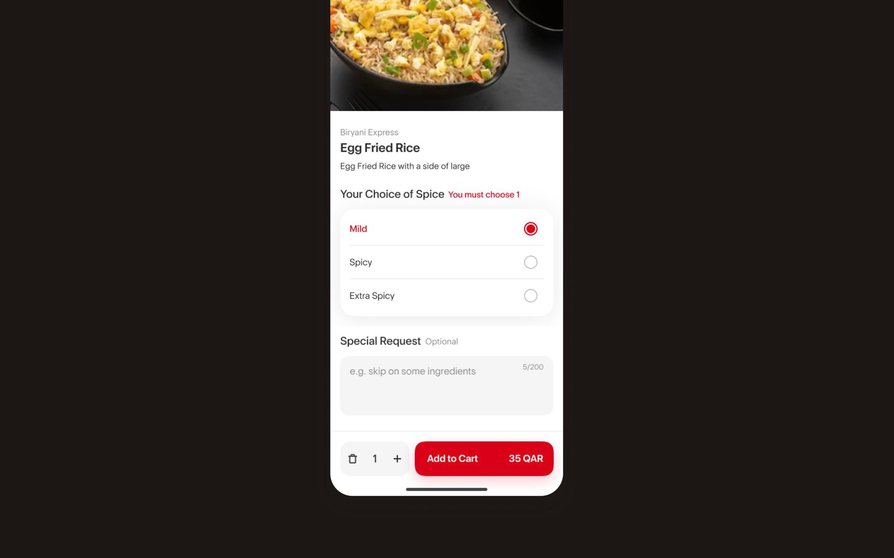
Meal customization
Customization is where carts die. The item sheet keeps the rules explicit and the exit always one thumb-tap away.
- Tell users the rule, in red, before they fail it.
- Optional stays optional. Special requests are clearly marked, with a character count — flexible enough for real kitchens, bounded enough to stay usable.
- The action bar carries the truth. Quantity, live price and “Add to cart” are fused into one bottom-anchored bar — the total updates as you choose, with no surprises at the cart.
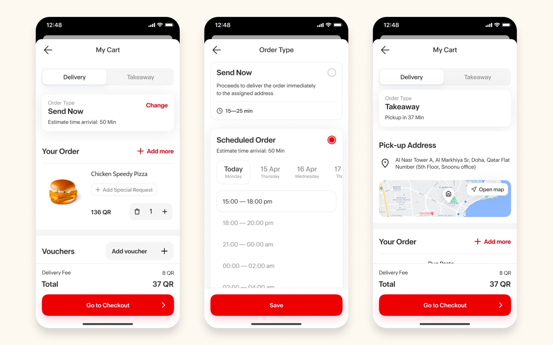
Adding items to cart
We had one cart and two questions: when and how.
The cart defaults to the fastest answer — send now or deliver to me — then lets anyone change either dimension without leaving the flow.
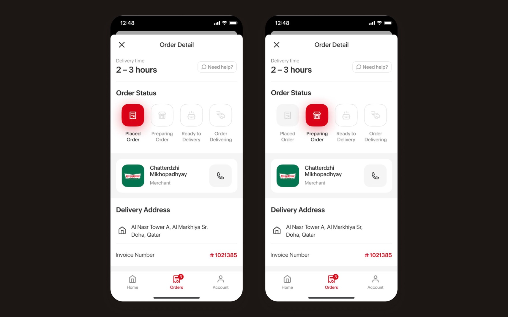
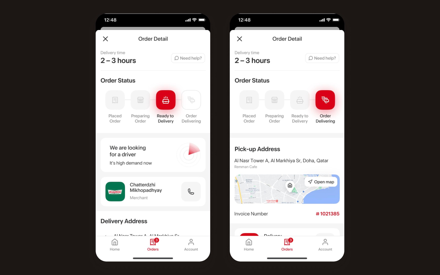
Track the order
Our approach here was to turn the wait into a progress bar. The challenge was to define and lay out all the important info:
- Wait-time
- Customer support access
- Order status
- Contact merchant or driver (depending on order status)
- Delivery information
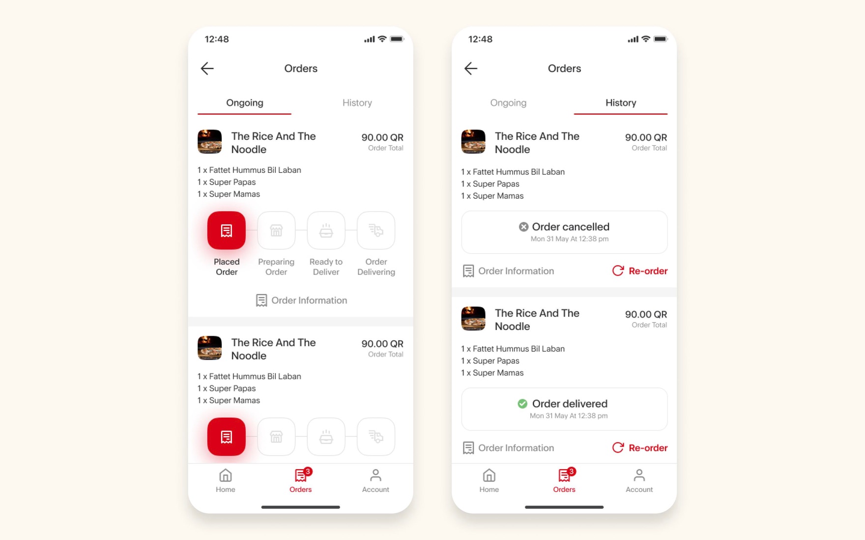
Closing the loop with trackable orders
The receipt isn’t a dead end — it’s the start of the next order. Post-order screens feed straight back into the speed flywheel.
Outcomes
- −31%
- median time to place an order
- +18%
- reorder rate among returning customers
- +9%
- completion rate
- −24%
- support contacts