What is this
Rave Safety Gateway exists because of a technical gap. Medidata’s EDC platform — where clinical trial sites log all patient data, including adverse events — can’t natively transmit that data to external safety reporting systems.
RSG is the bridge. Study developers configure the field mappings so the right data flows to the right place in the right regulatory format (ICH E2B). Safety specialists then review and approve transmissions before they reach the safety system.
The product worked. But the experience had been built around the technical architecture, not around the people doing the work. That’s what we were there to change.
How the work started
The product team came to us with a request: update the visual design, clean things up, make it feel more current.
Research stage (~6 weeks)
- Structured kickoff with the Product Team
- Analyzed current workflow
- Talked to 8 users (study developers)
- Researched direct competitors
- Looked at similar solutions inside the company (different products)
- Did multiple brainstorm sessions
What we learned
It became clear that “update visuals” was the wrong frame.
The problems weren’t cosmetic. They were navigational and cognitive. The tool exposed its internal architecture to users instead of abstracting it. The mental model it imposed didn’t match how study developers and safety specialists actually thought about their work.
We pushed back on redesigning things for the sake of redesigning them. We protected what users said was working, focused on what they said was hard, and defined scope around real pain — not product team assumptions.
The product team wanted to redesign lots of small things for the sake of redesigning. They were somewhat neglecting what users actually wanted to change, and what didn’t need to be touched at all.
 Before After
 The key insight
Study developers don’t complete a configuration mapping in one go.
A full mapping session can take hours. Users routinely stop partway through and come back later, sometimes days later.
The old interface had no memory of this. There was no way to see at a glance what was done, what was left, or what state a section was in. Every return meant re-orienting from scratch, scanning the entire mapping to figure out where you left off.
The tool needed to hold the user’s place — not just technically, but visually. So dropping back in after a break meant immediate orientation, not re-discovery.
1/3 Design decision — Navigation
The old structure forced users into a flat “list of studies → drill in” pattern that gave no sense of position and no way to navigate across sections without losing context.
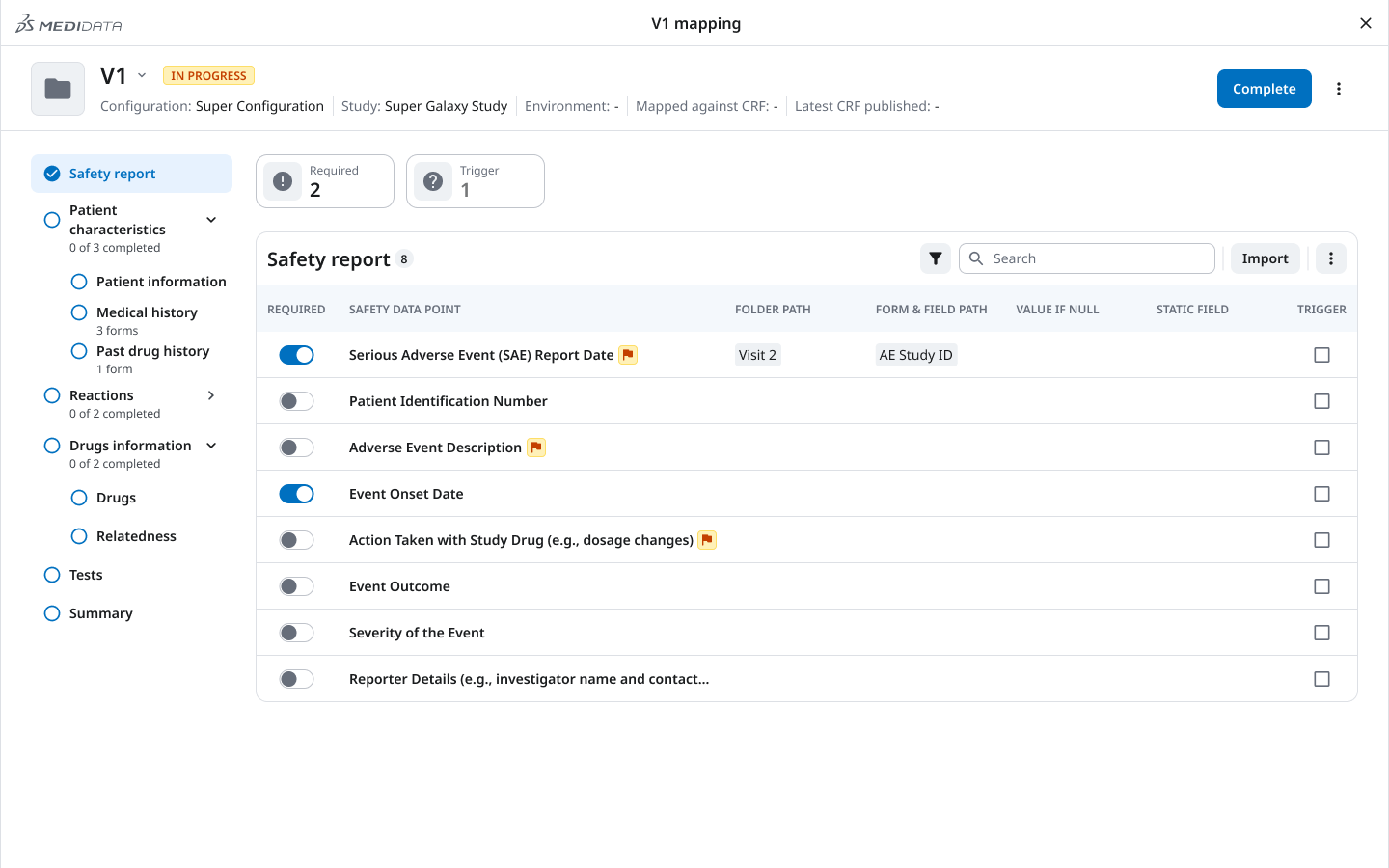
We introduced a clear hierarchy: client → study group → study → Safety Gateway tab. Within a study, the left sidebar gives persistent access to all sections, so users always know where they are and can move without losing their place.
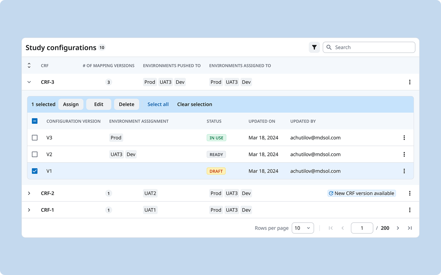
2/3 Design decision — Versioning model
The relationship between a configuration, its versions, and the environments it had been deployed to (Production, UAT, Dev) existed in the backend but was invisible in the UI. Users had to hold this model in their heads.
We introduced an explicit versioning structure: each CRF has named configuration versions (V1, V2, V3), each with a clear status (Draft / Ready / In Use), each explicitly assigned to one or more environments. The table makes the full picture readable in a single view — no clicking in to find out what’s live.
This replaced a cognitive load with a legible system. We designed this versioning model from scratch.
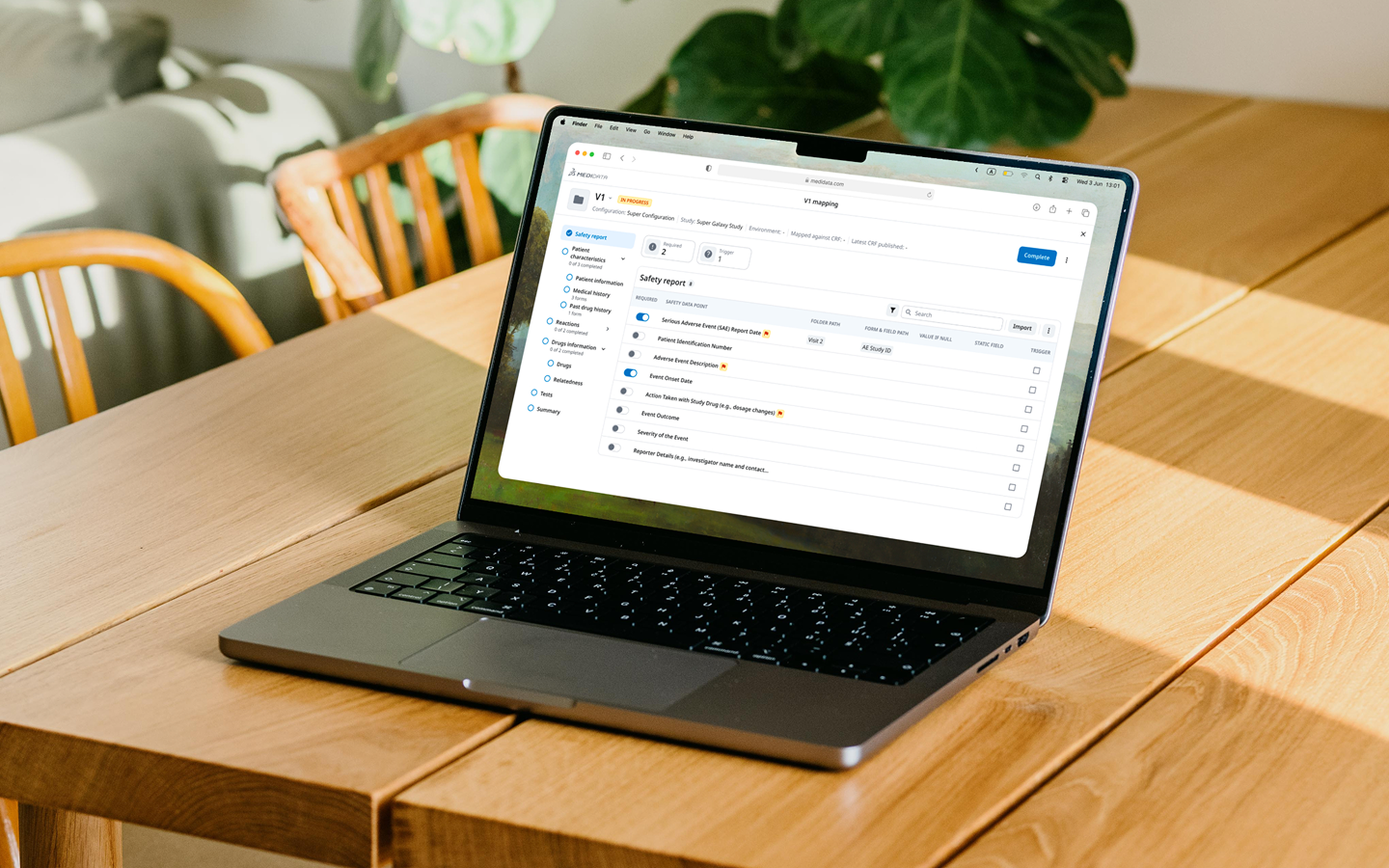
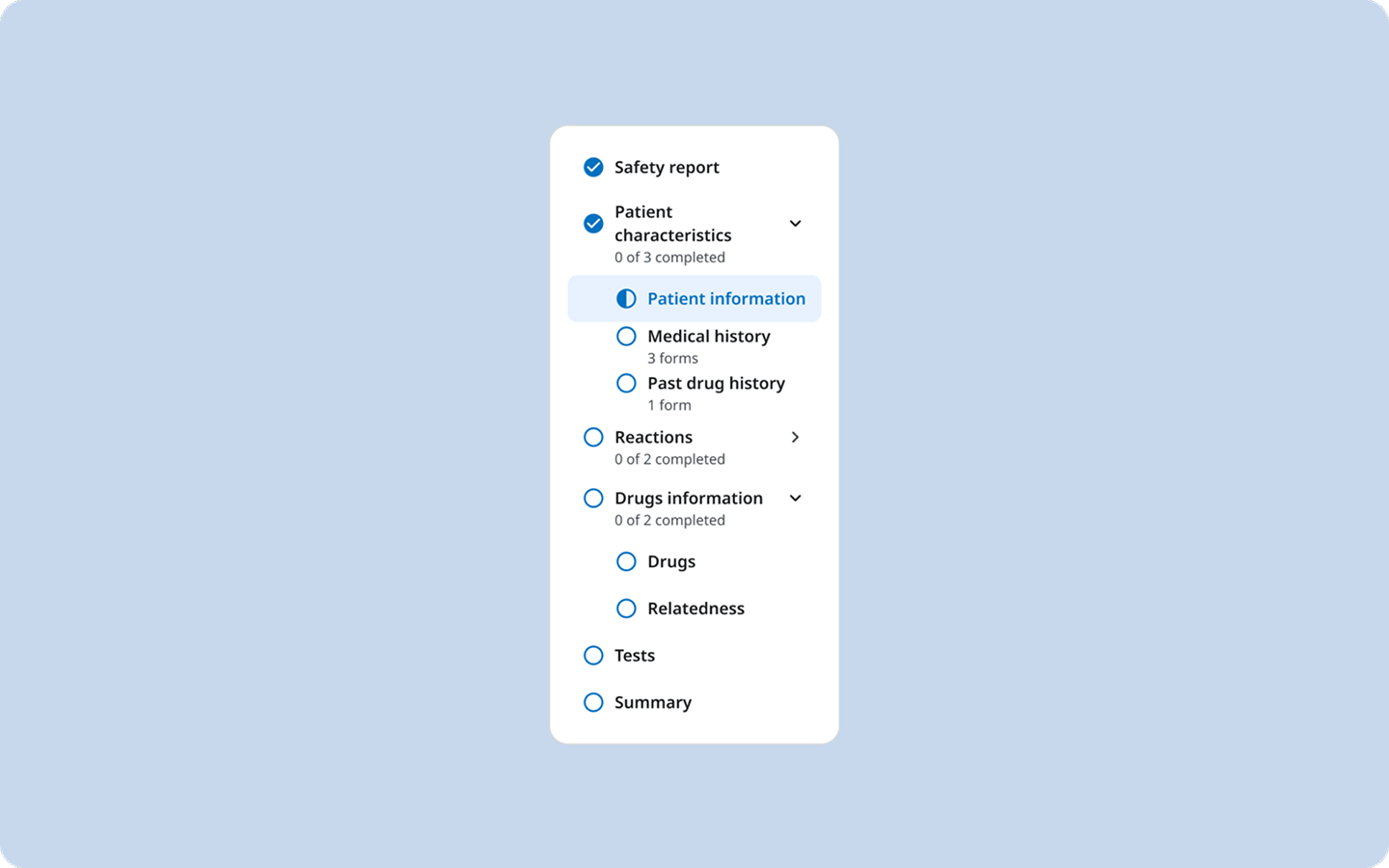
3/3 Design decision — Progress sidebar
From user interviews, we decided that the mapping interface needed to tell users both where to go and what was done.
Drop back in after a break, open the sidebar, immediately know what’s done and what’s not. No scanning. No re-discovery.
Hardest decision
The product team asked for a visual refresh. Six weeks of discovery showed the real problems were structural, not cosmetic.
The hardest call was pushing back on the brief I was given, protecting what already worked and arguing for the deeper redesign the research pointed to.
Outcomes
- ~75% faster
- configuration cut from around 2 hours to roughly 30 minutes
- 1 admin in 1 sitting
- where it used to take multiple specialists across several sittings
- +4 new clients
- just after the demo presentation